The Nature of Light
Light is the basis of all photography. Without light, we are all left in the dark. But what is light? Light it turns out is a form of electromagnetic radiation (EMR), fluctuations of electric and magnetic fields which move through space as waves move over the surface of a pond. The electromagnetic spectrum includes radio waves , infrared, visible light, ultraviolet, x-rays and gamma rays.

Scientists classify EMR by its wavelength, the distance between two consecutive crests of a wave. Human eyes it turns out are only sensitive to the range that is between wavelength 780 nanometers and 380 nanometers in length. A nanometer is one billionth of a meter. These are very tiny waves! This very special area is called the visible spectrum or visible light. Most color photography deals only with the visible spectrum.
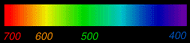
Wavelength of colors in the visible spectrum
In order to see a color print or anything for that matter, we must place it under a source of illumination. There are several common effects that are used to produce this illumination.
Incandescence
Solids or liquids heated to 1000 degrees K in temperature or greater emit light. K is short for Kelvin, the absolute version of Centigrade scale. Water boils at 373 K, so 1000 K is very hot! The tungsten filament light bulb is the commonest man-made source of light on earth, it glows at about 2854 K. The sun, is a natural incandescent source whose surface is at about 5800 K.
Phosphorescence
Phosphors are substances that absorb energy and re-emit light. The phosphor coating of a common florescent tube emits visible light when excited by energy released within the tube. An electric arc between the tubes electrodes creates ultraviolet light which excites the phosphor causing it to glow.
The problem for color photographers is that not all light sources are created equal! The spectral energy of these light sources varies greatly. The color content of the light source is usually described in terms of the temperature of an incandescent emitter which produces a color spectrum closest in color to that source. The higher the temperature the bluer the light. The lower the temperature the redder the light. Tungsten light bulb illumination is very orange compared to daylight. The color characteristics of the light source are referred to as its spectral power distribution.


The Nature of the Object
The color we perceive an object to be is determined by which wavelengths of light are absorbed or reflected by the object. Only the reflected wavelengths reach our eye and are seen as color. The leaves of most common plants absorb red, orange, blue & violet . At the same time they reflect all the green wavelengths and are therefore seen to be green in color. These characteristics of the object are referred to as its spectral reflectance.

The Nature of the Human Eye

The human eye is the last link in the chain of color vision. The human eye has a simple two element lens. The cornea is the front or outer element and the lens is the back or inner element. The amount of light entering the eye is controlled by the iris which lies in between the two. The light passes through a clear gel called the vitreous humor and creates an inverted image on the retina at the back of the eyeball .
The retina is the light sensitive part of the eye. Its surface is coated with millions of photoreceptors. These photoreceptors sense the light and pass electrical signals indicating its presence through the optic nerve to stimulate the brain. There are two types of photoreceptors, rods and cones.

The rods are sensitive to very low levels of light but are monochromatic and cannot see color. That's why at very low light levels, humans see things in B&W.
The retina contains three types of cones. Different light sensitive pigments within each of these three types responds to different wavelengths of light. Red cones are most stimulated by light in the red-yellow spectrum. Green cones are most stimulated by light in the yellow-green spectrum. Blue cones are most stimulated by light in the blue violet spectrum. This phenomena describes the spectral sensitivity of the eye.
Spectral sensitivities of the red, green and blue cones.
To make the eye "see" any color of the spectrum it is only necessary to stimulate the three types of cones in a manner similar to the way the actual color would.

It is not necessary to actually produce the color of light! This is exactly how a CRT monitor works on a computer or TV. If you look closely at the face of your TV with a 4x loop you can see the individual RGB color phosphor stripes glowing. A color TV or computer monitor is really not a color device at all, its a RGB source of illumination. When you back off to a normal distance the eye combines the red, green and light and is fooled into seeing the whole color spectrum. Most color file formats used on computers, store the individual color data in exactly this way. For each point of light or pixel in an image a 24 bit binary number is stored describing the exact amount of red, green and blue making up the pixel.
Additive Color
This representation of color is called the additive color system. It explains how we see objects that emit there own light. This system states that all perceivable color hues can be created by mixing different amounts of red, green and blue light. Equal amounts of red, green and blue give the sensation of white. The absence of red green and blue gives the sensation of black.
Subtractive Color
Objects which are seen because they reflect light from another illuminant source are explained by the subtractive color system. Color prints fall in this category. The color perceived by the eye while looking at a color print depends on all three factors discussed above — the spectral power distribution of the light source, the spectral reflectance of the object and the spectral sensitivity of the eye.

In a color print, you control the spectral sensitivity of the paper at a given point when you adjust the color balance while looking at the image in Photoshop. The light source the print is viewed under is often out of your control and can be a problem. Certain pigment based inks appear to be identical under light sources of one type, say 2800K tungsten filament sources. The same inks viewed under a different light source, say 6500K daylight appear very different. This phenomena is called metamerism and is a problem for Epson 2000P owners.
When taking a photo, the spectral power distribution of the illuminant is even a bigger problem. Standard color films are either balanced for daylight or a tungsten light source. Anything in between, will require color adjustment in the digital darkroom for accurate color.
It is quite possible the artistic effects created by color shifts are highly desirable. Not many of us would want to trade the warm hues of sunset or sunrise for an accurate set of whites! Once we understand the nature of color, it is possible to control it. There are many color tools in Photoshop that allow you to do this, but that is the topic of yet another tutorial.
http://www.luminous-landscape.com/tutorials/color_and_vision.shtml
Colour Management
Introduction to Colour Management
Profiling Your Monitor
Monitors need to be profiled to give a universal look to any image, so that your image looks the same on any monitor anywhere in the world.
When you purchase a monitor, a good tip is to always search reviews for information on calibration tests that have had good results.
Recommended monitors:
* Apple Cinema Display
* LaCie 321
* Eizo ColourEdge - these are top of the range and expensive but included to give you some idea.
Laptops in general do not calibrate well. A Macbook is thought to calibrate well but even this is not as good as a desktop monitor due to being a laptop with a variable viewing angle between the user and the monitor.
Use a solid calibration device such as a puck or a spyder. Basically they read colour swatches off the monitor and create a custom monitor profile.
Most popular calibration devices:
* X-Rite Eye-One Display 2
* DataColor Spyder3 Pro
The best conditions for editing and calibrating are a dark room with neutral walls. Colour walls will reflect onto your monitor and alter the colour of your calibrating.
Most calibrating software have very good instructions and easy to follow software.
If you are calibrating to use with printers, the recommended settings when using the calibrating software are 6500k, gamma 2.2 and if you have the setting, 140 luminance for CRT. If you don't have any settings to play with, just keep clicking the right arrow or click continue and the software will calibrate automatically once you put the puck or spyder on the screen.
Setting up Photoshop to link with Monitors/Printers
Setting Photoshop Colour Settings
(The sentences starting with >> refer to photoshop menu options)
>> Edit/Colour Settings
'Click' more options. The Working Space option is your most important choice as this provides an embedded colour space so that the printer, monitor and pc can communicate with each other.
sRGB - used primarily for web use or for machine like prints ie 3.5x5, 4x6.
Adobe RGB 1998 - this is the most used and is used if you are printing with ink-jet or light-jet printers. It has broader colour options ie hues than sRGB and gives more accurate colours.
Prophoto RGB - this is an even broader range of colour options and may be the future colour space most people use. If you do use it you must employ soft proofing as discussed later.
CMYK - is used by magazine and book publishers and all you need to do is convert from another profile. Beware though it looks very odd but it will be right.
Colour management policies - tick the boxes to make sure you catch any mismatched images you have that you may need to convert.
Conversion Options - Relative Colormetric and Perceptual are thought to be the best options and are very useful in soft proofing. Experiment to find out which suits the image best.
It can be an idea to save this as your own profile so give a meaningful name ie Dorcas Adobe1998 Settings and give a description ie output to ink-jet and light-jet printers and this option will appear under >> View/Proof Setup/Custom settings.
Paper Profile Usage
Think of this as a converter, translating colours from the screen to the printed page with accuracy.
Make sure your paper profiles ie ICC profiles are installed in the right locations.
PC XP VISTA: C: Drive/Windows/System 32/Spool/Drivers/Colours
MAC OS 10: Hard Drive/Library/Colour Sync/Profile
Every printer comes with some sort of paper/printer ICC profiles. If you are using special papers or even Epson you need to regularly check their websites for any updates for paper profiles.
Every type of paper has it's own unique profile.
Soft Proofing Your Image
Monitors display more colours that your printers can reproduce.
To see a more accurate view that your combination of paper and printer will produce you need to soft proof every image that is to be printed.
>> View/Proof Setup/Custom
Device to Simulate - pick the type of paper that you are using ie gloss, matte
Rendering Intent - Perceptual
Black Point Compensation - always tick to map blacks properly
Simulate Paper Colour - this is a personal choice and you need to experiment to see which fits you. I tick this as Epson can print quite dark so I get a more accurate view. This is also the point where I will make any further colour adjustments in photoshop.
Save - this will store your profile for this paper.
To Soft proof:
* >> View/Proof Setup - you will see your saved option at the bottom of the list. Make sure it's ticked.
* >> View/Proof Colours - ticking this then switches your saved option on. You need to make sure you have done both steps.
Printing
>> File/Print
Colour Management - these options all appear together
* Document Profile - Adobe RGB or prophoto
* Colour Handling - Photoshop handling colours
* Pinter Profile - this is your printer plus paper profile
* Rendering Intent - Perceptual
* tick Black Point Compensation
* tick Match Print Colours
Printer Options
* Pick Your Printer
* Media type - your paper type as this is used to match ink use.
* switch off high speed printing if you have it to avoid banding
Colour Management
* depending on your printer options, tick No colour adjustment or manual colour adjustment with no colour adjustment or turn off colour management
http://www.fotodayz.co.uk/page6788.html
My work with colour management
For our lesson we were instructed to take 3 photographs of the same subject, but with 3 different camera settings. The settings were:
*F5.6, 1/15, Daylight WB
*F5.6, 1/15, Shade WB
*F5.6, 1/15, Sharpness and Contrast increased via camera controls.
We then had to import these pictures into lightroom.


We then had to export the 3 pictures. One time as sRGB and the other time as Adobe RGB.

We then uploaded those pictures to Flickr and compared the differences.
First images sRGB

sRGB F5.6, 1/15, Daylight WB

sRGB F5.6, 1/15, Shade WB

sRGB F5.6, 1/15, Sharpness and Contrast increased via camera controls
Adobe RGB

Adobe RGB F5.6, 1/15, Daylight WB

Adobe RGB 5.6, 1/15, Shade WB

Adobe RGB F5.6, 1/15, Sharpness and Contrast increased via camera controls
I then took what i had learned today about white balance and with my brand spanking new cannon 7D took a picture of my cat when i finally got my hands on it. (The camera that is... Not the cat)

No comments:
Post a Comment